This case is based on an app I created for one of Juspay's hiring assignments. What started with a task, I decided to explore, because Fintech is a field that actually interests me. I had some background in investments and market charts, but had to learn some new terms, such as tax harvesting, through this project.
Project Summary
Tax harvesting helps individuals optimize their tax liabilities by strategically selling investments to offset gains. However, many users struggle to identify opportunities in their portfolios and understand the potential benefits. There is an opportunity to create an app that simplifies tax harvesting, educates users, and provides actionable insights through an engaging and visually appealing design.
Yep, that's what the assessment said…
Research
Without wasting any time, I started learning about tax harvesting since the topic was completely unfamiliar to me. Luckily, my best friend (Kartik), who is an aspiring Chartered Accountant, helped me understand the basic terminologies.
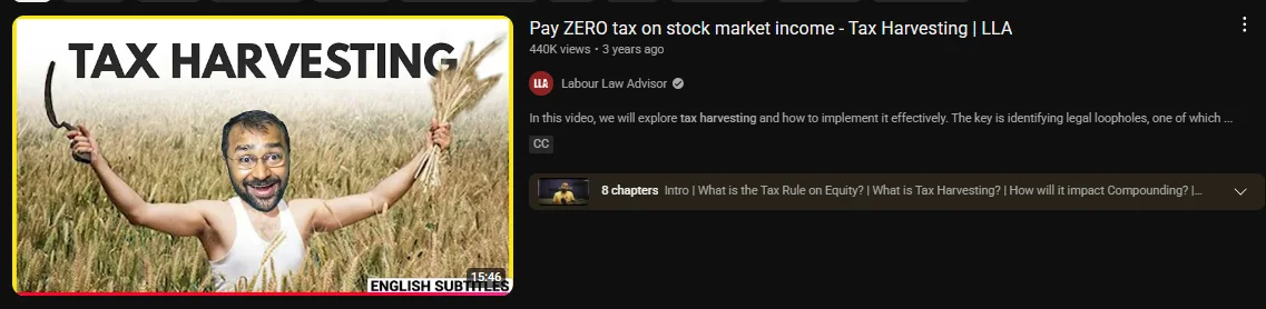
This video summed up all of my doubts.
Mapping User Personas
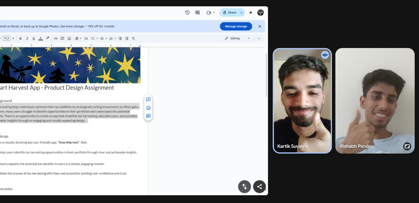
A meet with Kartik to map user personas.
Persona 1: An investor who is losing on taxes (Kartik, 20) 💸
Kartik is an aspiring CA student. He learned paper trading when he was in 12th grade, but after jumping into the actual market the losses shook him, and he was unable to save the rest from tax.
Goal: Wants to learn ways to save taxes and maximize profits. Found out about the jargon of "Tax-Loss Harvesting" but wants to learn and implement it as well.
- Finds most investing platforms too advanced, or lacking in education
- Overwhelmed by jargon and lacks a step-by-step guide for execution
What does Kartik need? An app that can help him save taxes on the stocks and assets that he holds, and also help him learn exactly what "Tax Harvesting" is.
So I finally decided to define the objectives based on this user.
Major Objectives
- Identify tax-loss harvesting opportunities
- Educate users on tax-loss harvesting
- Easy execution of harvesting actions
A wireframe of the bottom bar, finalizing the major screens that are needed according to the pain points:
- Home: a dashboard showing all his stocks from the broker
- Learn: a place to do courses and keep track of progress
- Profile: includes profile and user settings
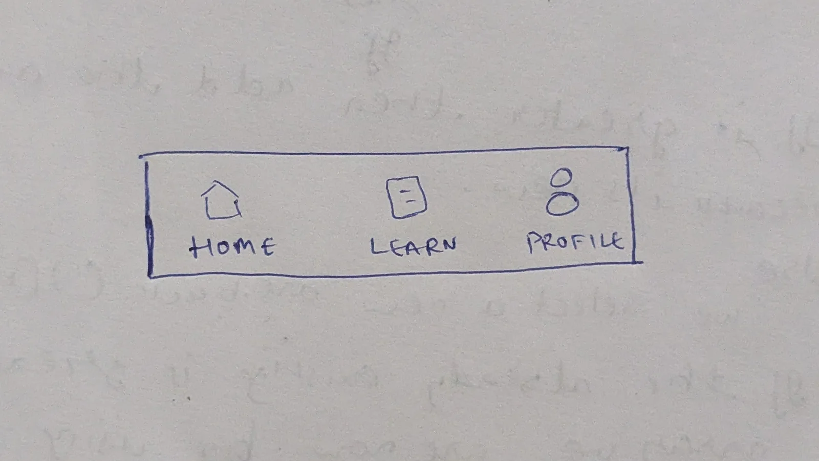
Bottom bar wireframe.
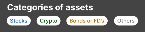
Further, I decided to categorize according to the brokers, not the type of assets.
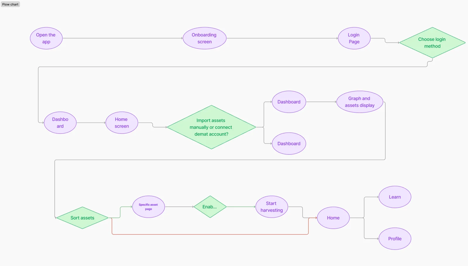
User Flow
Time to define a rigid user flow.
Wireframes
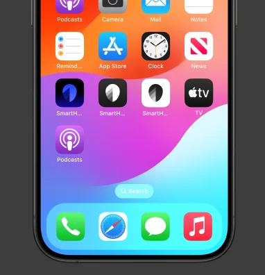
Logo.
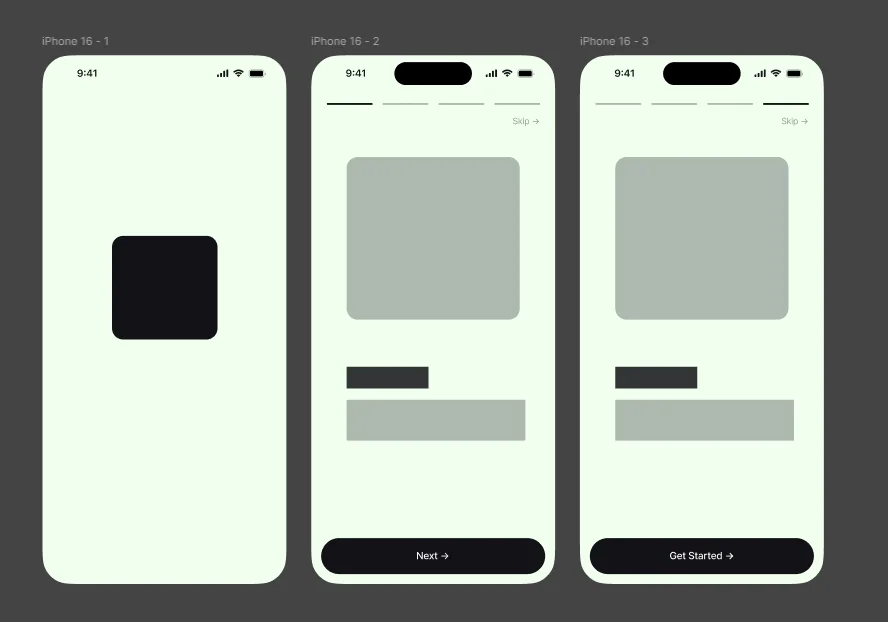
Onboarding wireframe. Instagram stories and WhatsApp status have one thing in common: they have progress indicators on the top, and also the count. I replicated that for the onboarding screen since it's modern and new.
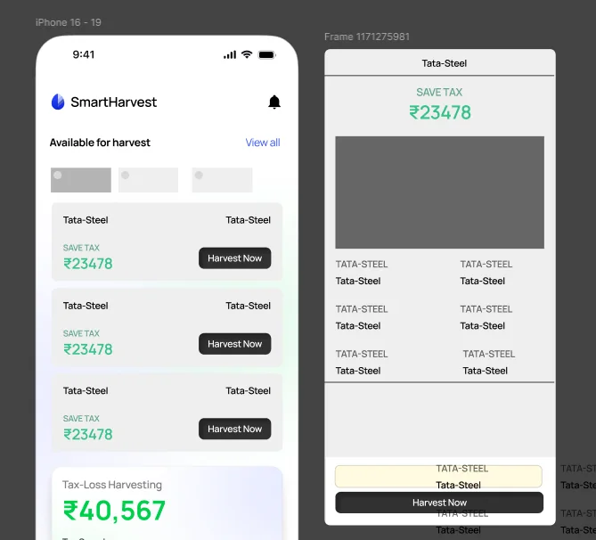
Dashboard / Home screen.
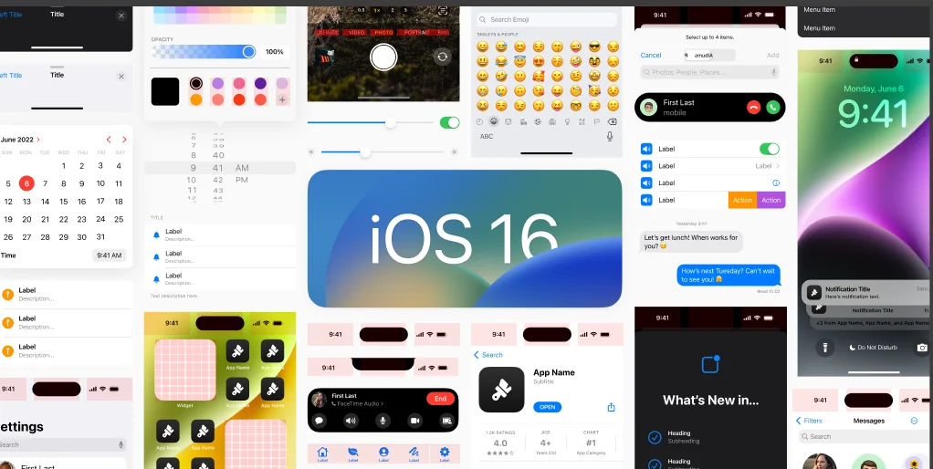
I made sure I was using the iOS HIG design system.

Brand identity. My design process involves creating low-fidelity designs first and playing with the color. So let's jump to the UI screens!